This case study has its own visual identity and stays in its own colors.
Case study · Spatial computing
A tool for thinking in the space around you.
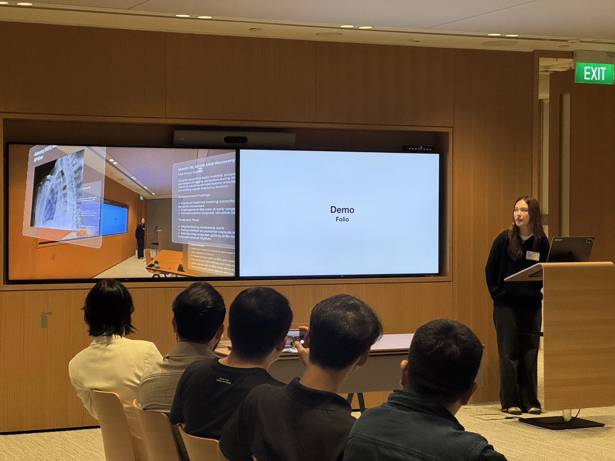
A working visionOS demo that lays complex, high-stakes information out in space rather than a 2D screen. It is a tool for thinking, built for the work a flat screen cannot hold all at once. I conceptualized, designed, and built it solo in Swift with no prior visionOS experience, and demoed it live to engineers at the Apple Developer Center. Medicine is the case I built it around, not the limit of what it is.
First, the ground
Spatial computing lets a computer place digital content in the real room around you. With Apple Vision Pro, you wear a headset, see your surroundings, and interact with windows and objects that float in space. Instead of everything living inside one flat rectangle, the whole room becomes the canvas.
Folio asks a simple question of that new canvas: if we finally have depth, distance, and position to work with, what should serious information look like?
The answer I kept arriving at is that this is not a place to put apps. It is a place to put thinking. Folio is the instrument for that: a room you lay a problem out in, walk through, and hand to someone else with its structure intact.
Why this reads differently
Screen design has had plenty of time to figure itself out. There is a right way to build a form, a known grammar for navigation, an agreed meaning for a floating button. Much of interface work is recognising the pattern that fits and executing it well.
Spatial computing has almost none of that. There is no settled answer for how far away a document should sit, what depth means. Or how someone finds a thing they put behind them. Apple's guidelines cover comfort thoroughly, but comfort guidance is not information-design grammar. It does not tell you how to compose in a room.
So every decision here had to come from perceptual psychology and human factors rather than from precedent.
The problem
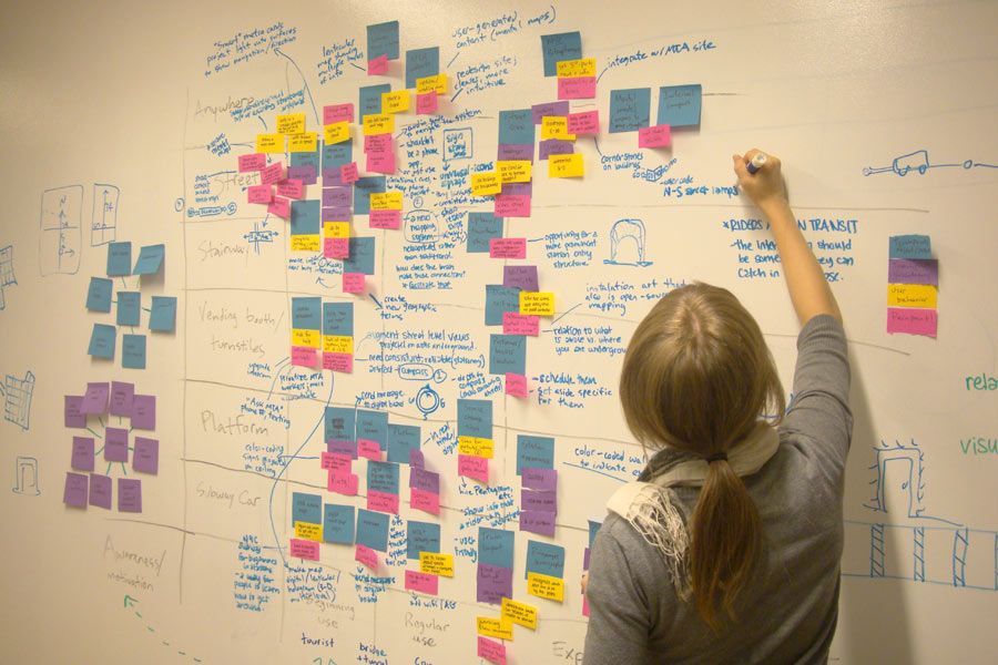
As a designer, I think in space. I cover whiteboards in notes and scatter post-its to consolidate an idea until it finally lands. That instinct is not a quirk. It is how the mind works best.
When information is forced into 2D, the brain does the work the interface should have done, building the connections mentally with no visual translation. The result is cognitive fatigue, missed connections, and slower decisions. The next frontier of clarity is not better screens. It is better space.


Who it's for
There is a category of professional where cognitive fatigue carries real cost. Their tools were built for flat screens, which force them to do the spatial work in their head before the real work even begins.


The flagship case: medicine
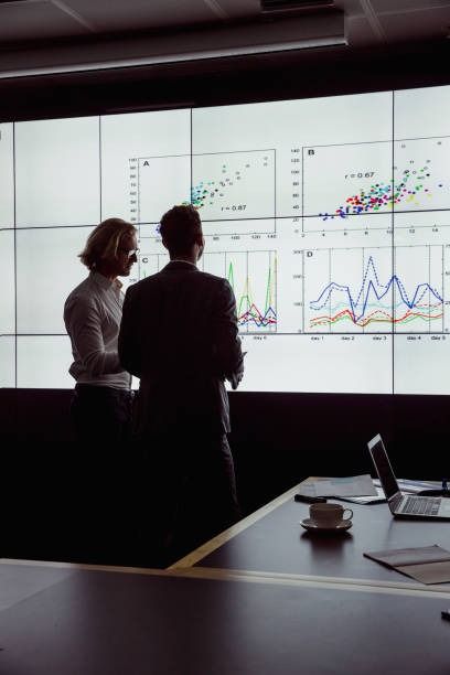
A clinician walking into a briefing has to mentally assemble imaging, notes, timelines and results from separate systems. That mental overhead has a cost. Folio exists to remove it, so I built the whole system around a constructed clinical case.
The insight
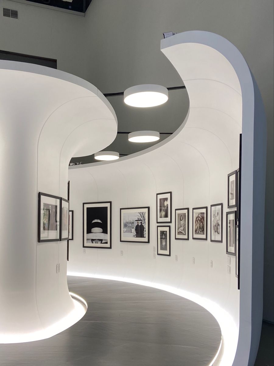
The hippocampus builds maps of physical environments. Placing information in places is a privileged channel into memory, the same reason memory palaces work.
We can only hold a handful of things in mind at once, about four to seven by classic estimates (Miller; Cowan). Spreading information across the room lets the environment hold it, freeing the mind to reason instead of juggle.
We perceive depth and grouping before we consciously focus. Encoding importance as depth means priority is read instantly, without reading a single label.
Studies of large and immersive displays find physical navigation less taxing than window-switching and scrolling, which reduces fatigue on long tasks.
In a 2026 mixed-reality vascular case, surgeons reported that spatial computing gave “superb visualization and better spatial awareness” than a conventional workstation, with intuitive gestures and a minimal learning curve.
Integration of high-resolution mixed-reality models into resident training, 2026
One thing to note: The strongest, most established evidence is for spatial memory, cognitive load and sensemaking. Direct proof that Vision Pro specifically cuts errors or decision time is early but promising, and the real sweet spot is complex, high-load, relational work. That is exactly the space Folio is designed for.
How it works
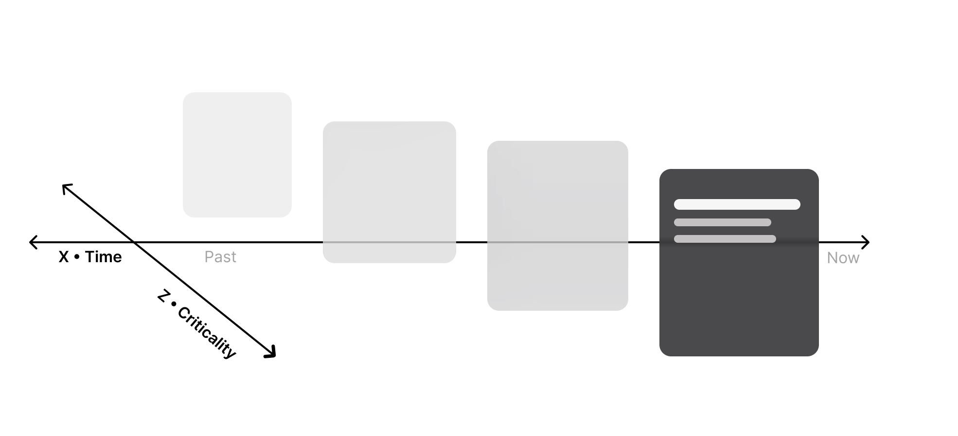
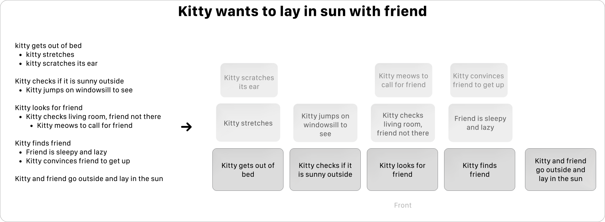
Screens have two dimensions. For decades we have tried to express priority, sequence and relationships, all inherently spatial ideas, on a surface with no depth, distance or position. Tabs, folders and digital workspaces are workarounds for that missing third dimension.
Where a panel sits places it in a sequence.
How far it is along the room maps to time.
How close it sits to you signals how much it matters.
The solution, in action
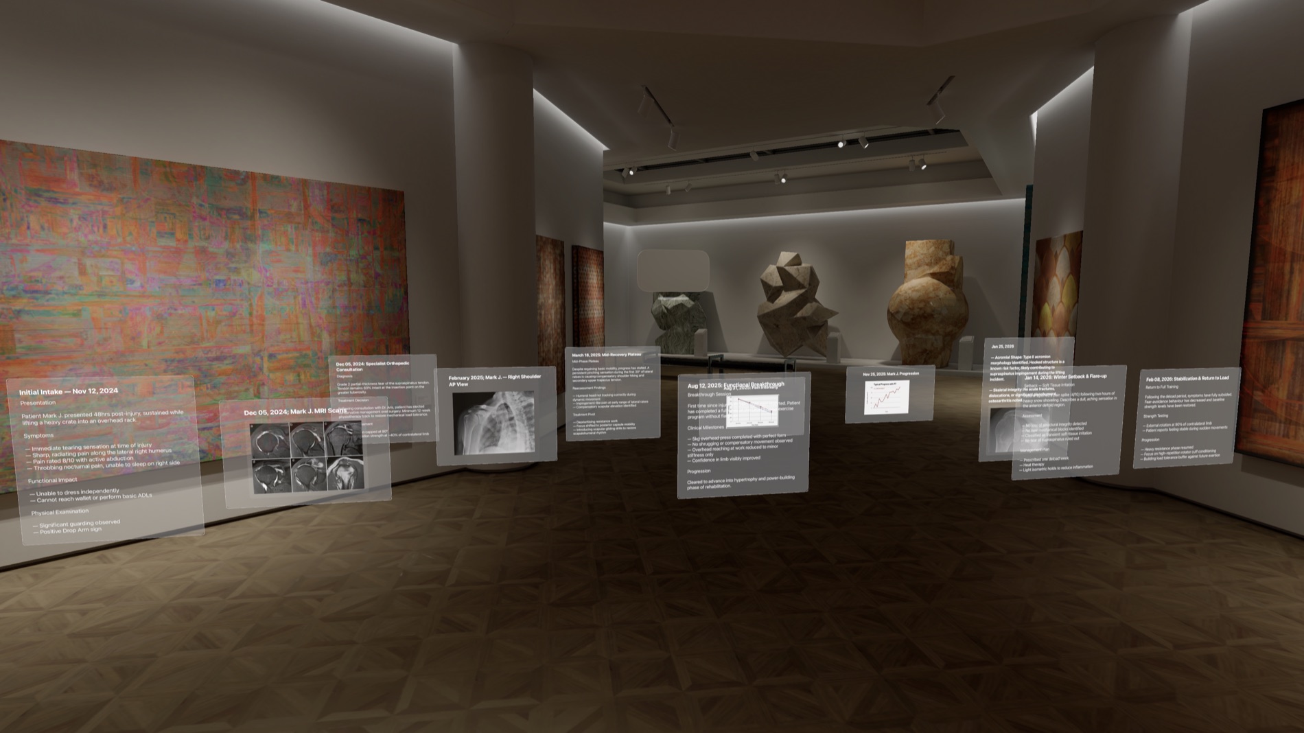
To stress-test the system, I authored a complete clinical case, Mark J., recovering from a shoulder injury across two years: MRI scans, longitudinal pain graphs and detailed clinical narratives, all placed in space.
The initial intake panel, dated Nov 12 2024: symptoms, functional impact, physical examination, all structured and immediately readable.
Each column is a point in time. Consultation, MRI scans, an AP x-ray, mid-recovery plateau, a winter setback, a functional breakthrough. As you move right, you move forward in the recovery.
Panels that sit further away are still accessible, but they are not competing for attention. Depth does the prioritising.
A clinician steps into the space and the full story of the patient's care is already in front of them: chronological, spatial, with priority built into the depth of the room.
Every choice, grounded in research
| Design decision | The principle it satisfies |
|---|---|
| Reports laid out left-to-right, chronologically | Spatial anchoring & hippocampal spatial memory |
| Depth encodes criticality | Depth cues & pre-attentive processing |
| You physically walk through the timeline | Embodied cognition: moving is lighter than clicking |
| The whole story is visible at once | Working-memory offloading & lower cognitive load |
Challenges I worked through
Making an abstract idea legible. If you were to make a theater app for viewing shows in the AVP, you can literally describe it as such. Since my idea was testing the bounds of what spatial computing could improve for us, rather than just being an app in the AVP, I really struggled to find the right way to explain it.
Learning the platform from zero. I started with absolutely no Swift and no visionOS experience and ended the project with a live demo on the AVP. I got the Apple demo of the Vision Pro at the start of this journey and that was actually my first time ever using any sort of VR headset. Then, with the help of AI, I was able to implement the ideas that I had. Figuring out how to think about design within this new realm and also how to use AI efficiently and properly communicate intent to it was definitely difficult. I got plenty of things wrong, was humbled a lot, but learned so much from it.
The outcome
I presented Folio and its live demo to an audience of Apple engineers and developers. For a concept built from zero in a single semester, I was really proud of this achievement.
A note on how I got here
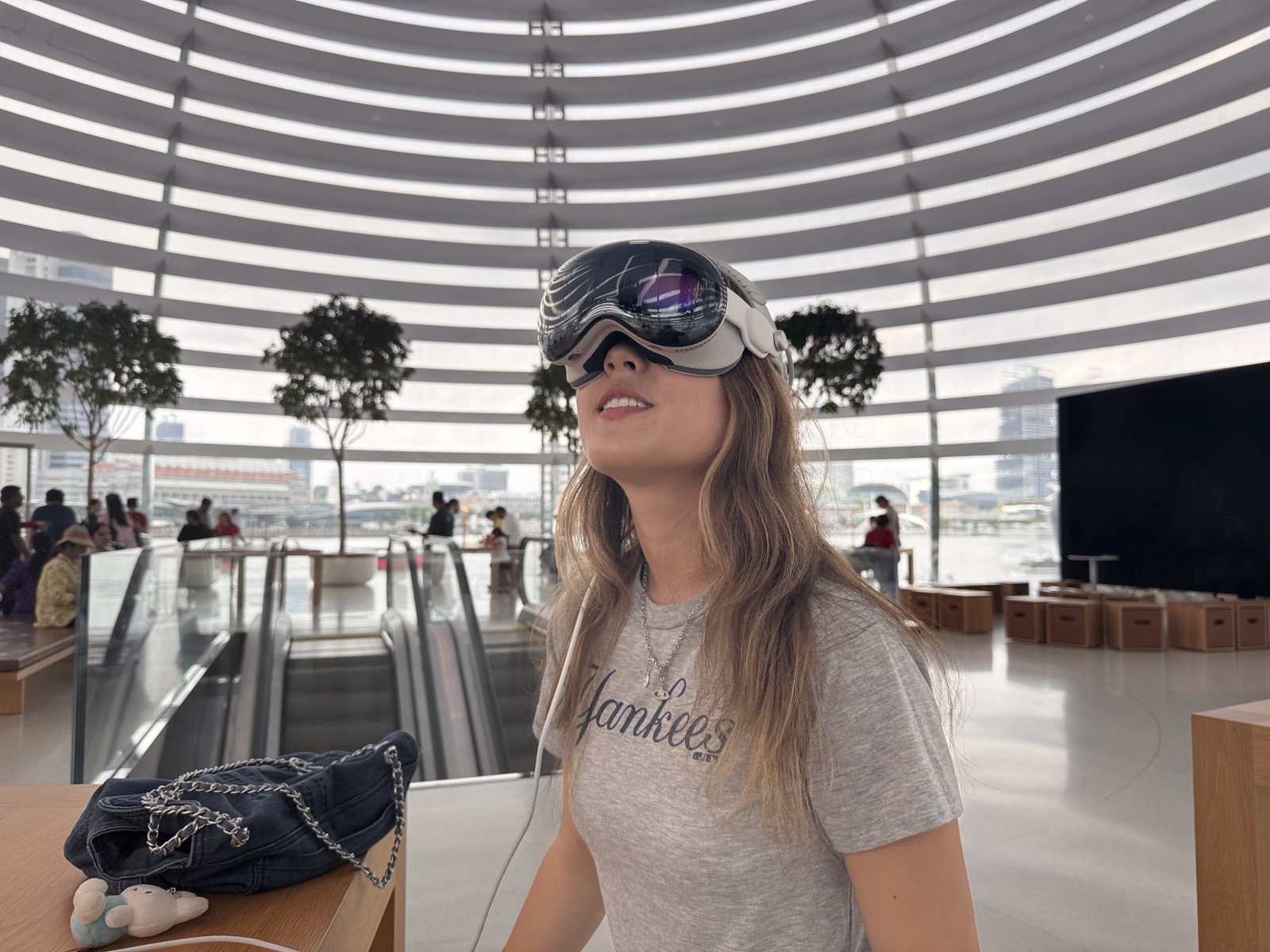
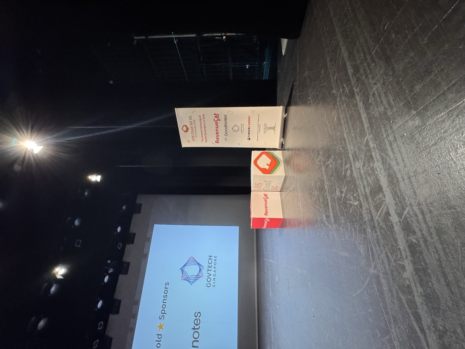
iOS Conf SG · January 2026
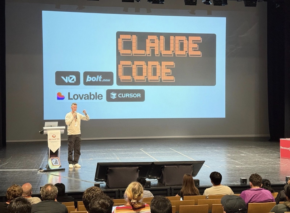 that's me
 I attended this conference at the very start of the semester when I was thinking of what to create for my project. For the first time, I attended an event full of independent builders shipping their own work. And for the first time I saw someone without a heavy technical background participate. All of a sudden, the distance between having an idea and having a running product started to look much shorter.
Fiachra MacFadden, a product designer, was that someone. He walked the audience through an app he had designed and built himself. Not an engineer, but a fellow designer presenting a finished product he had personally shipped and is now even making revenue.
This reframed my mindset as a designer. There is a certain formula for aspects of design which are definitely critical, but with this newfound idea that I could also build something from start to finish, I started to break out of that structure. This was just a personal deficiency but I think the comfort of having those “formulas”, although the process for design is still abstract, was causing me to unintentionally limit myself. If something felt too ambitious I would scratch it from a mental note, or if something seemed unrealistic or less conventional as well.
Becoming capable of building helped me zoom out a lot. I wasn't just handing off a design and seeing what someone had to say about its feasibility. I was that person and I had to distinguish if it was feasible while also thinking holistically about the product and if a certain design change is both possible and productive. These principles I would have to remind myself to reflect on before, but now with this more builder mindset it just became natural.
Reflection
Folio started as a question about a new canvas and ended as a working demo I presented to Apple engineers. The thing I did not expect to learn was how much of spatial design is restraint. My first layouts filled the room because they could, and every one of them was harder to read than the version with fewer panels in it.
I built the medical case first and the spatial grammar second, which meant I kept bending the rules to fit the demo I already had. Starting again, I would define the grammar on its own against an abstract set of information, then apply it to medicine and find out where it breaks.
I would also get the headset onto other people far earlier. I tested the layout on myself for weeks, and my own tolerance for density is not a useful sample.
Folio has never been formally tested, so these are the measures I would set up.
What's next
For the concept right now, the layout is defined by the builder. The next evolution is handing that control over: input your own data, arrange it in space, and send that arrangement to someone else. Not a document, not a dashboard, but the actual spatial layout, intact. The person receiving it gets the context, the relationships and the hierarchy, in the space the information was designed to live in.
Because the screen was never the limit. It was just the starting point.
Selected sources
These ground the design decisions above. The evidence for spatial memory, working memory and sensemaking is well established; direct Vision Pro clinical outcomes are early-stage and framed that way throughout.