Is this a diet app?
No, and I was careful about that. No daily target, and nothing turns red. The nutrition layer is a weekly mirror of how you have been cooking, and then it stops talking.
No. A weekly mirror, never a daily target.

This case study has its own visual identity and stays in its own colors.
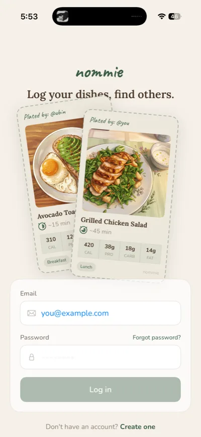
A way for you to document and share your home cooked meals and personal recipes. Easily keep track of your favorites, discover more for your specific goals, and document the details.

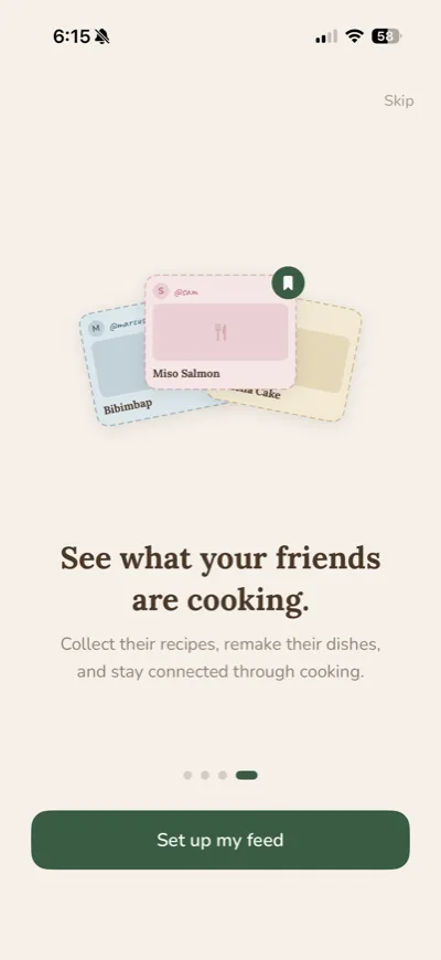

Overview
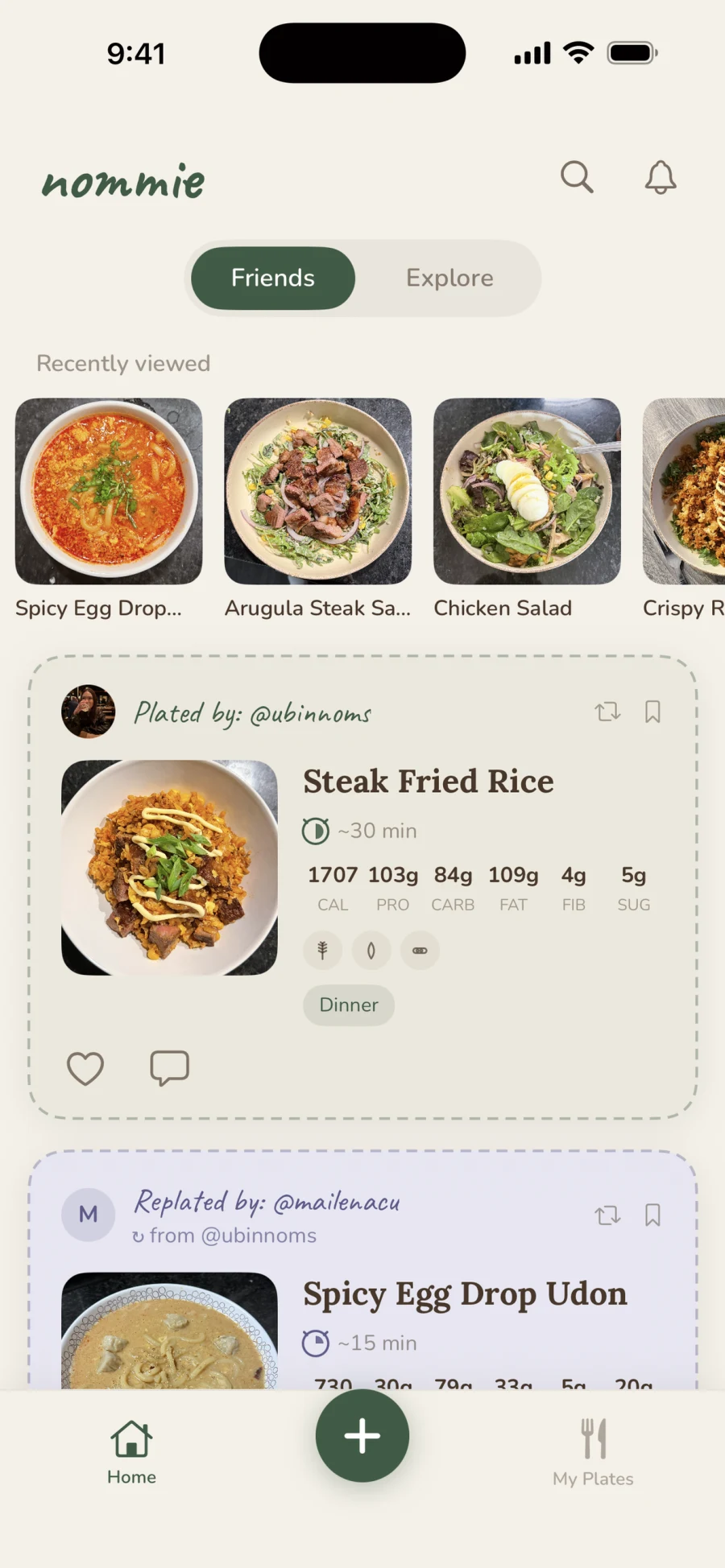
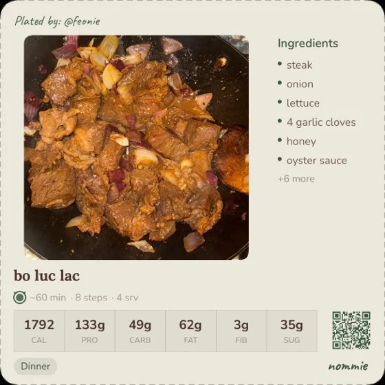
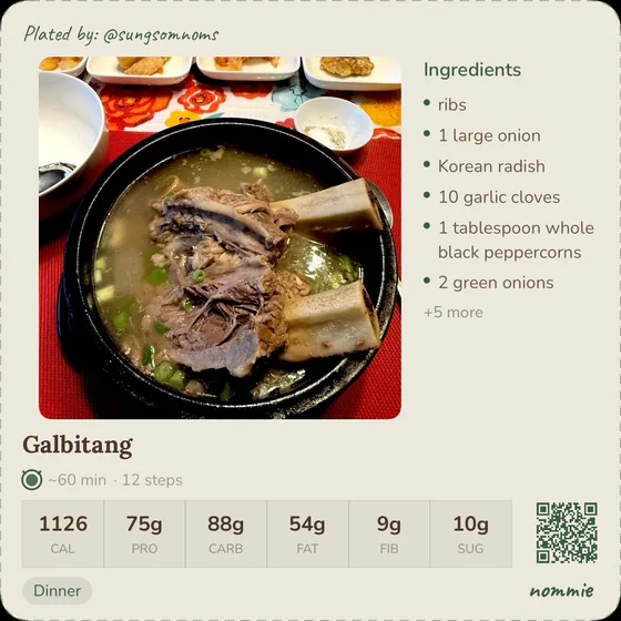
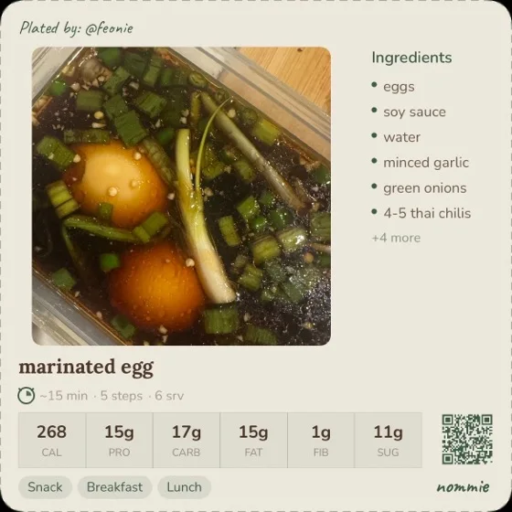
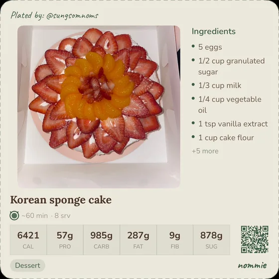
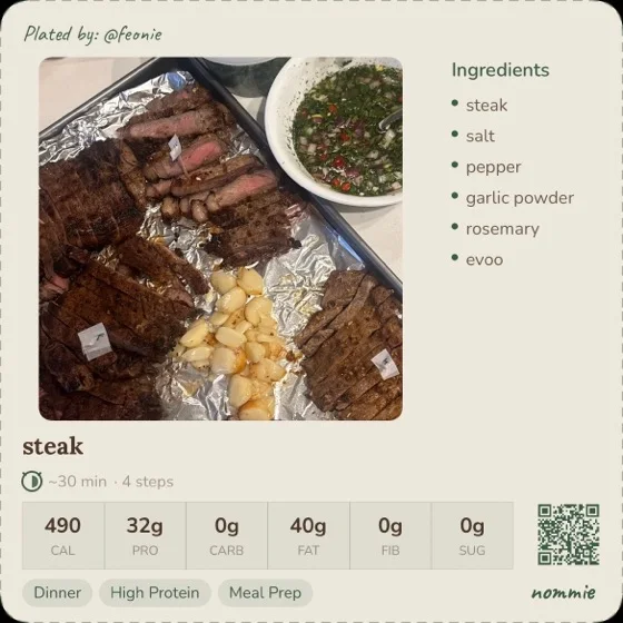
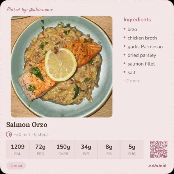
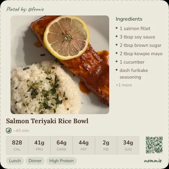
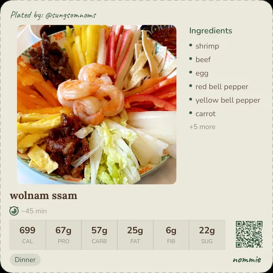
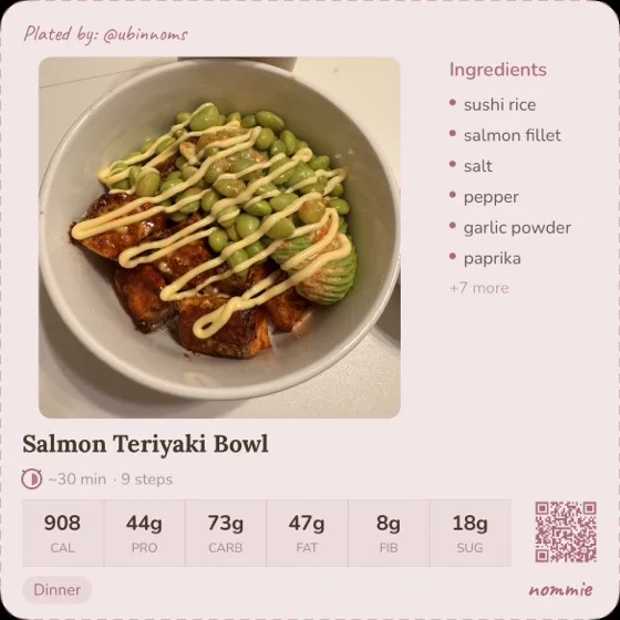
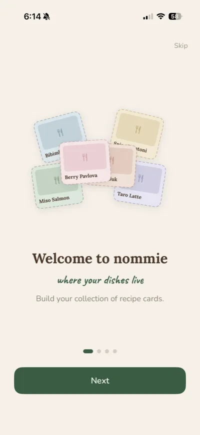
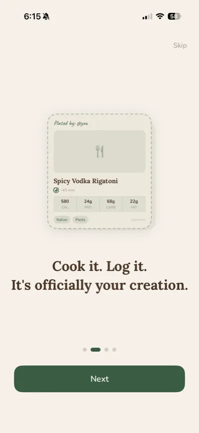
Nommie is a social recipe app for people who actually cook. You document a meal, it becomes a card, and the card travels anywhere you want to send it.
I built the whole thing solo over four months: the research, the brand, the illustration, the SwiftUI app, the Firebase backend, and a content-based recommender I wrote myself. It went through TestFlight with real cooks in their own kitchens, and it is now live on the App Store.
The spark
Nommie started from something ordinary: dinner at my place. I cook most nights, I train, and I want food that is genuinely nutritious and worth eating twice.
What I did not have was anywhere to keep any of it. My recipes lived in my head, in my camera roll, and in a notes file I never reopened. People kept asking how I made things, and every time I rebuilt it from memory.
The target user persona was just me at the end of the day. I then brainstormed the vibe and character of the app and got super excited about the potential.
Everything after this page came from that one problem.

The first vision
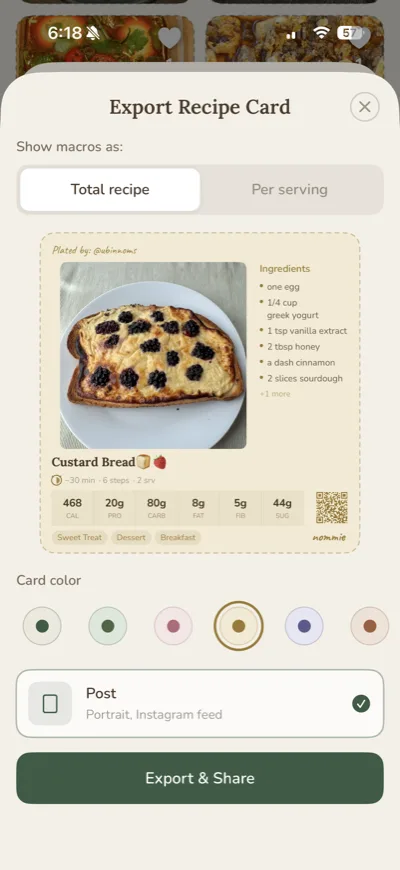
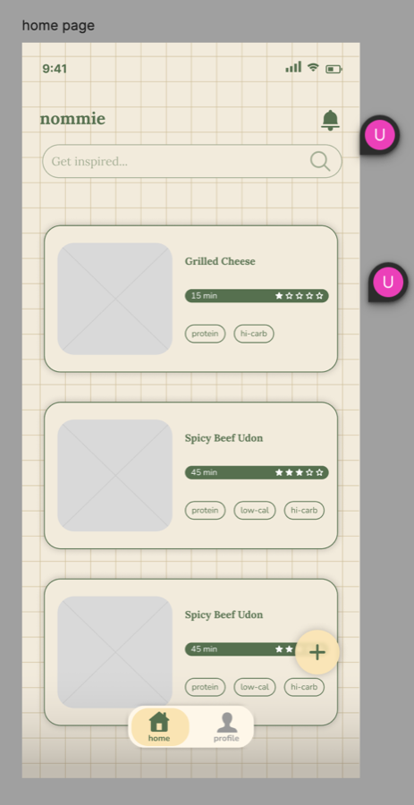
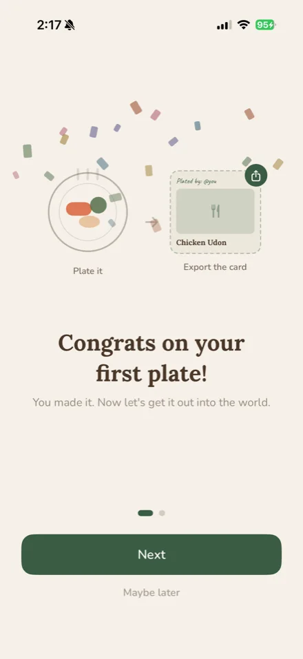
I frequently found recipes that I wanted to make and save on social media. The chefs would either put the recipe in their caption, personally DM it to you, or link out to a personal blog where they stored them. I thought: what if there was an app that acts as a personal cookbook and holds all of your recipes, but with a tangible “token” aspect that can be shared anywhere. So people who use social media to document their cooking can simply attach a recipe card with a QR code that links back to their Nommie account, and that becomes the consolidated place to store their recipes, and recipes in general.
Type
Lora for headers, Nunito for body, Caveat for signatures.
Palette
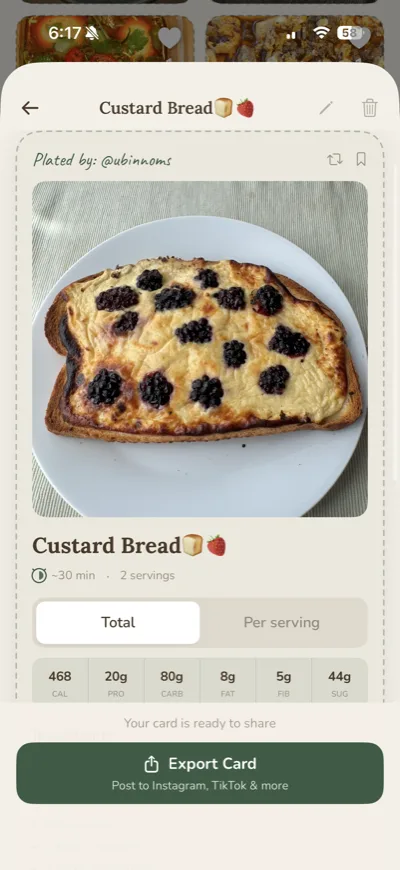
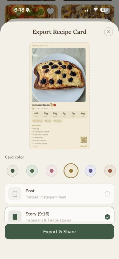
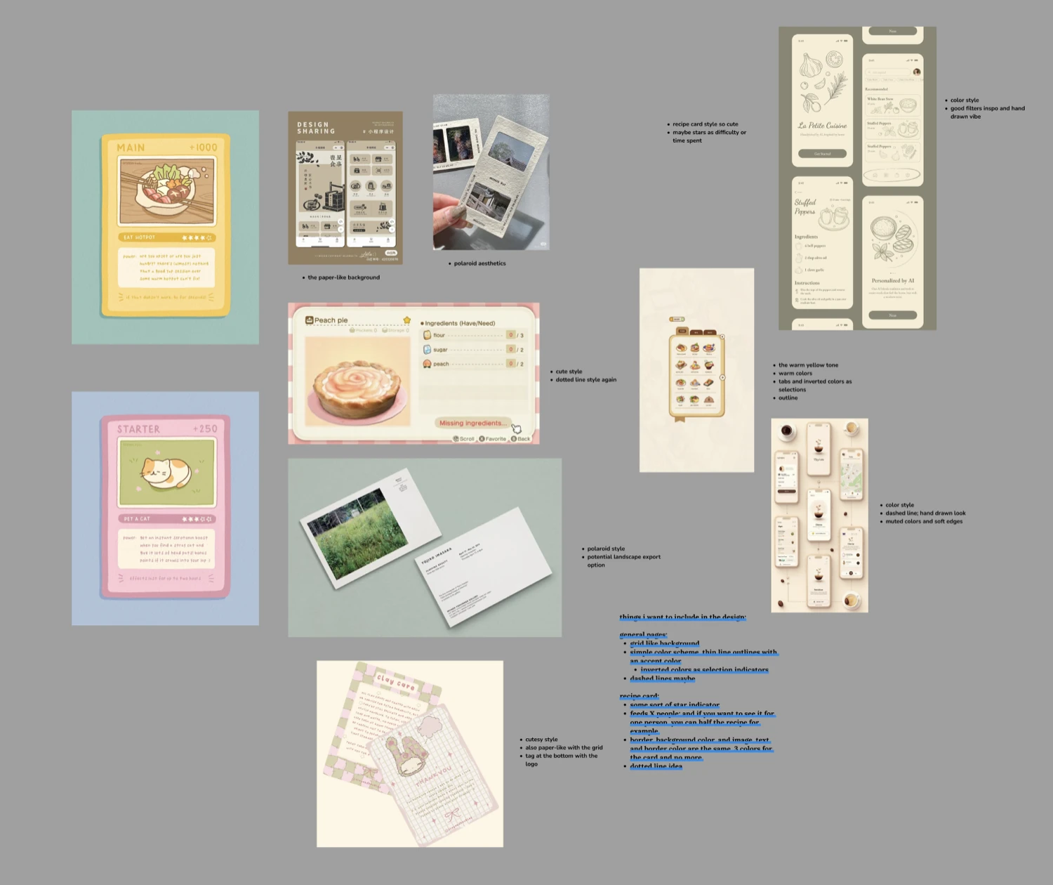
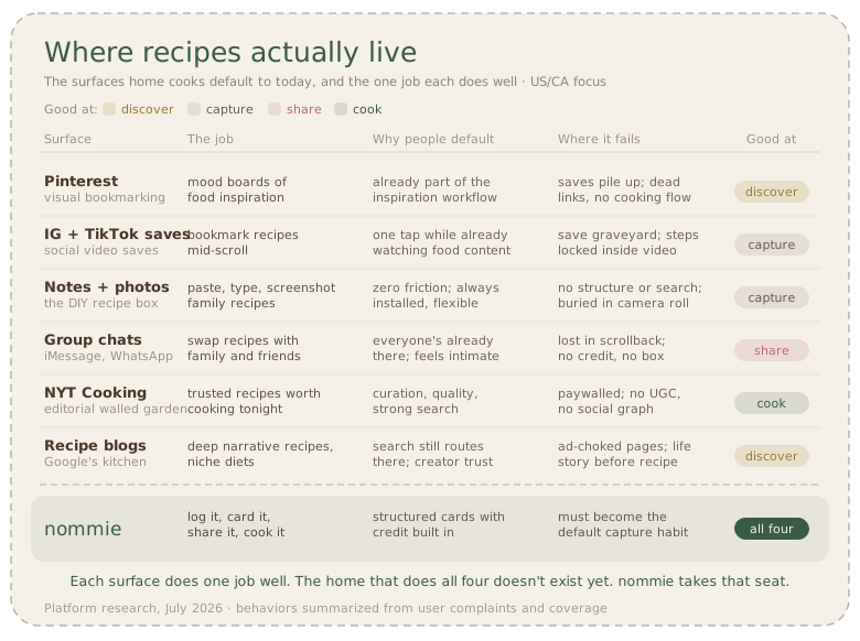
I had a lot of fun figuring out how the token card would look. I wanted to make sure it would be interpreted as something similar to a Pokémon card, an artifact that could be posted or texted to friends and family.
The design thinking
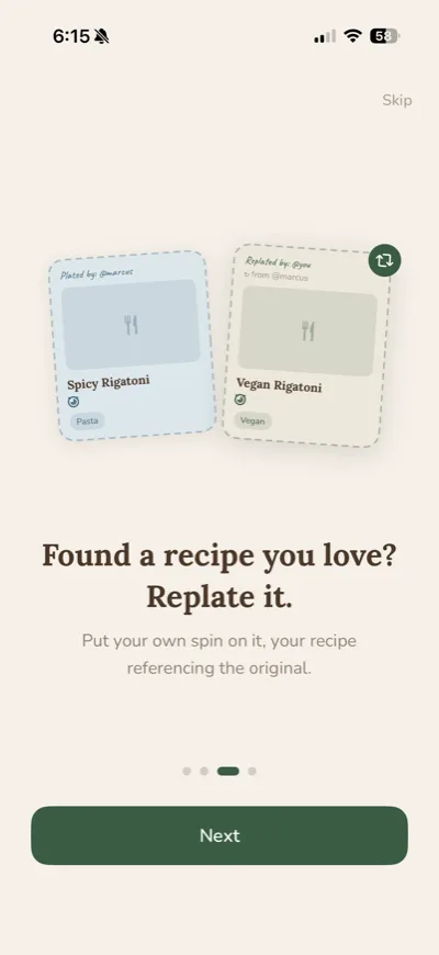
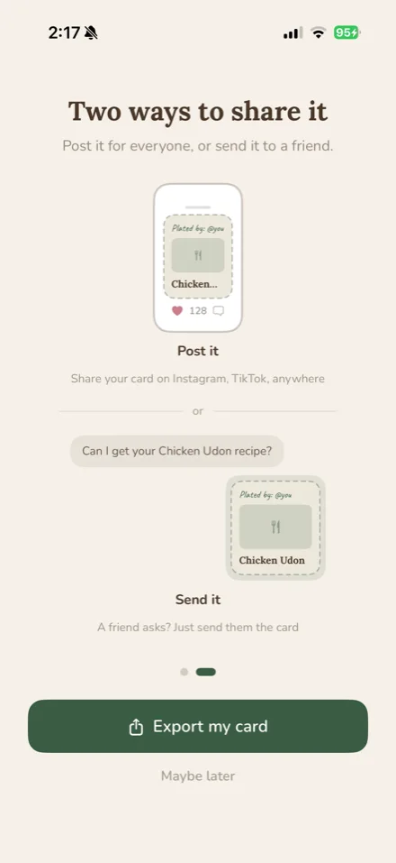
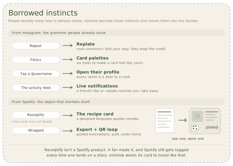
The whole concept leans on behaviors people already have. The recipe card is the unit of value and the unit of marketing: made to be shared, replated, and recognized, the way a Spotify Wrapped card spreads. These artifacts shaped the design long before any talk of retention.
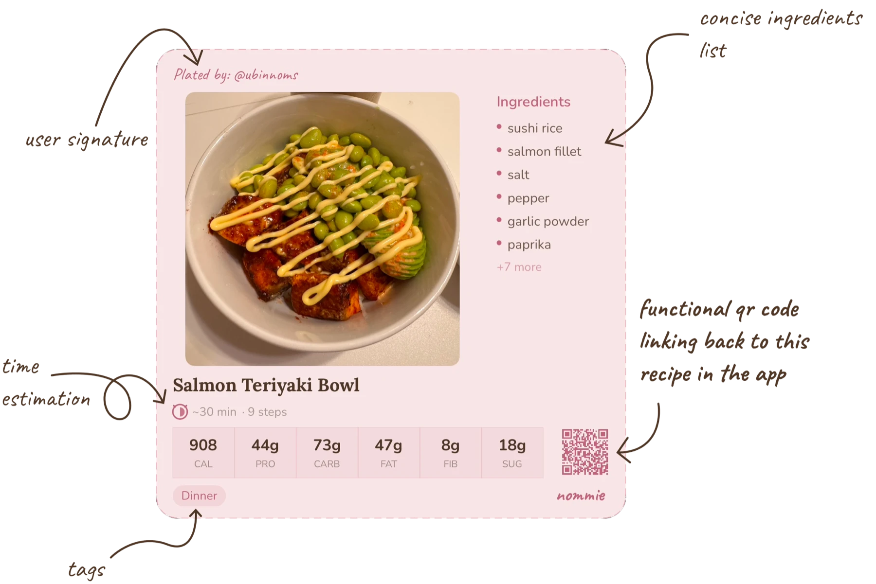
After you create your first recipe, this flow appears automatically. I wanted the first card to explain what it is for, so the animation gives that purpose a clear moment.
Designing the recipe flow
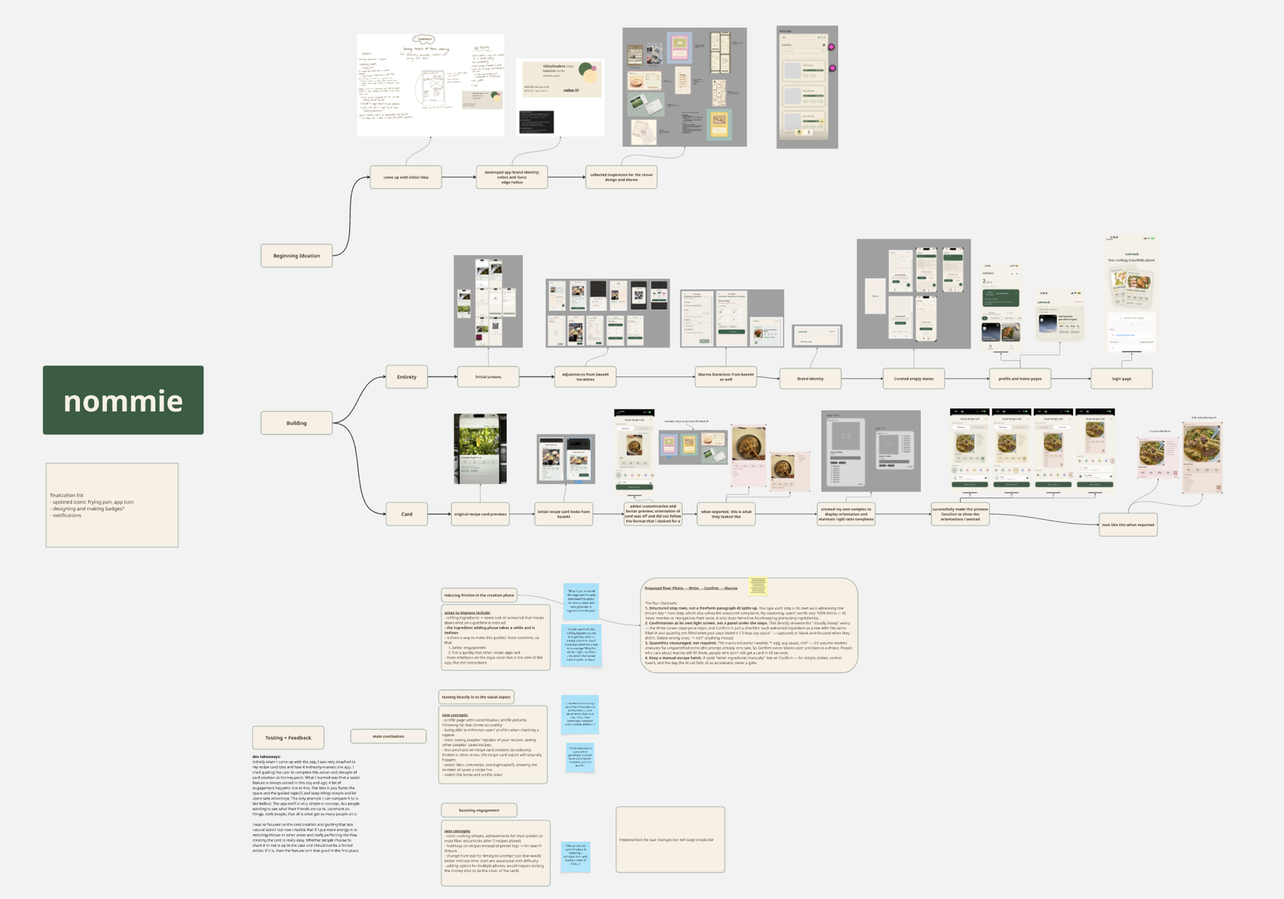
Once the first build was stable, I launched it to TestFlight and got a handful of beta testers using it in their own kitchens. I intentionally did not provide them with the premise to test if my idea was getting across or if I needed to adjust the delivery. A lot of what came back was about the micro-interactions, the small moments of friction that only surface when someone is actually cooking. One piece of feedback in particular pointed at something bigger.
“…I get tired after adding ingredients and then get lazy… if there was somehow a way to encourage filling the whole recipe card from conception, that would make it easier to share.”
TestFlight tester, first iteration
You typed a dish name, then added each ingredient and quantity one by one, then steps. The AI came in only at the end for macros. It felt like data entry, and people quit halfway.
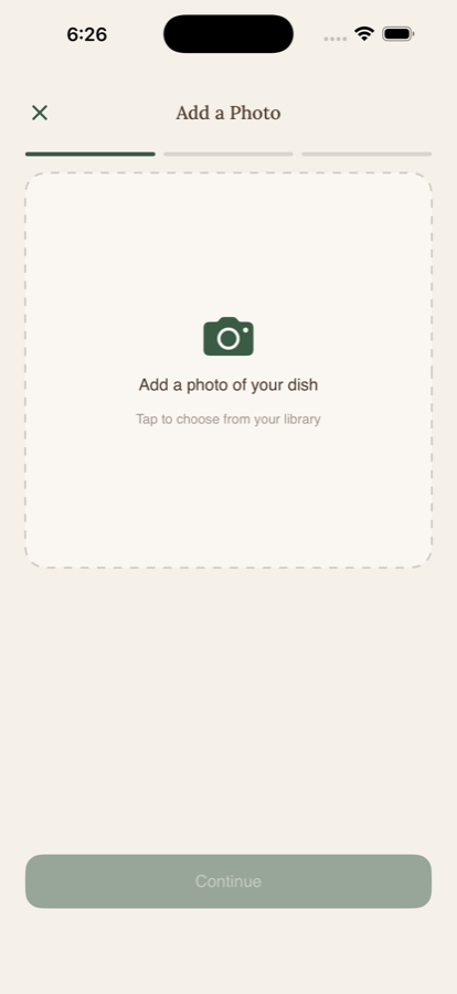
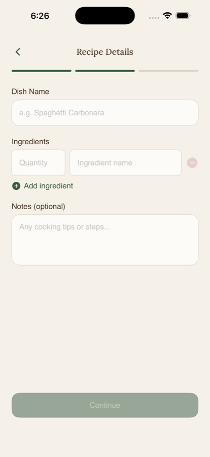
Now you write your process in plain language, and one AI call reads it back as structured steps, gathers the ingredients, and, in the same request, infers the macros, cuisine, tools, and dietary flags as editable green suggestions.
Photo → Write → Generate steps and ingredients → Macros
Four decisions behind it
Knowing when to stop
More design does not always mean better. I explored three ways to trigger a card export, trying to make the interaction more intuitive.
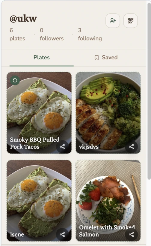
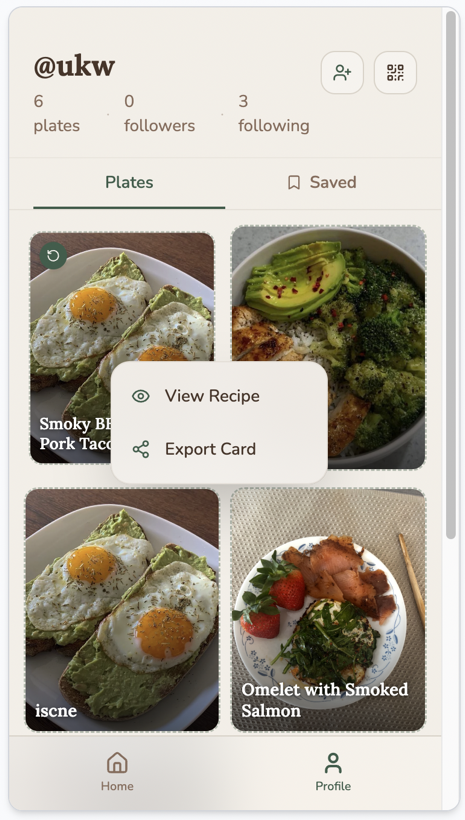
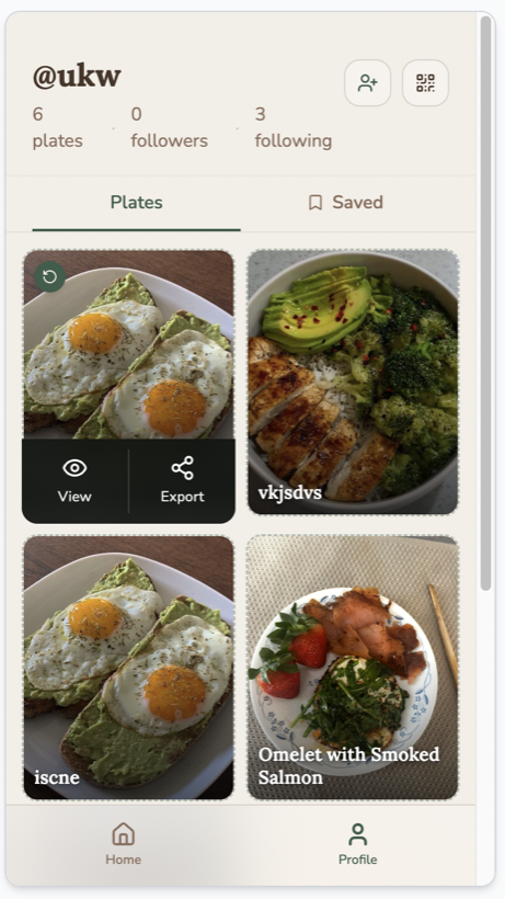
So yes, I ultimately decided to stick with my original simple export flow. The other flows overcomplicated that action and quietly forced the export. This realization helped me unearth another deeper, fundamental issue in my flow.
I came in attached to the recipe card and treated creating one as the main action. What testers helped me realize is that a share should never be forced. If I reduce friction everywhere else, making the card becomes easy, and whether someone shares it is up to them.
My dev takeaway, after the first round of testing
Stepping back
I am a design-forward person. I love the interactions and the visual appeal but I also love product. Testing forced me to zoom all the way back out again. A cute app with no reason to come back is not a good product. This was the moment I grew the most in this journey. I learned to carry the business perspective, retention and growth, and not just the screen in front of me.
Finding focus
People enjoyed the look of the app but retention dropped off quickly because there was no real reason to come back. Part of that was because not everyone cooks everyday, part of that was there weren’t a ton of users, but the biggest part was it lacked context and discovery.
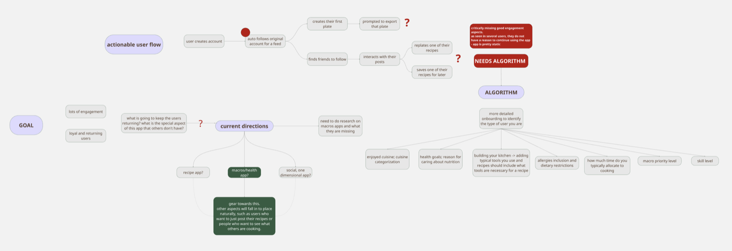
The research
To commit to the wellness direction, I researched other apps in the category.
of users remain by Day 30. Four churn drivers are lonely logging, the chore of it, precision anxiety, and ending with the diet.
of Americans tried to eat more protein in 2024. Most discover food on social. A rising, reachable market.
The competitive teardown
| App | Biggest strength | The opening for Nommie |
|---|---|---|
| MyFitnessPalThe default | Unmatched database breadth. | Bloated, ad-heavy, impersonal, and lonely. |
| MacroFactorThe coach | Best adaptive coaching algorithm. | Pay-to-play, solo, tuned for serious dieters. No community. |
| CronometerThe lab | Nutrient depth and accuracy. | Clinical and joyless. No cooking, no people. |
| LifesumThe pretty one | Best-in-class visual design. | Gorgeous but still solo. No real feed or cooking. |
| Cal AIThe shortcut | Lowest-friction photo logging. | Estimates only. No recipes, no community. |
What I built
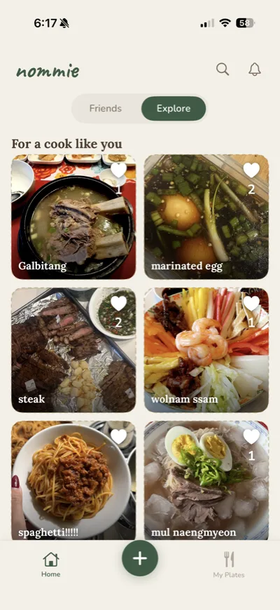
The payoff is one system: an onboarding that learns what kind of cook you are and what your nutritional goals are, which then feeds a recommender that gives personalized recommendations.
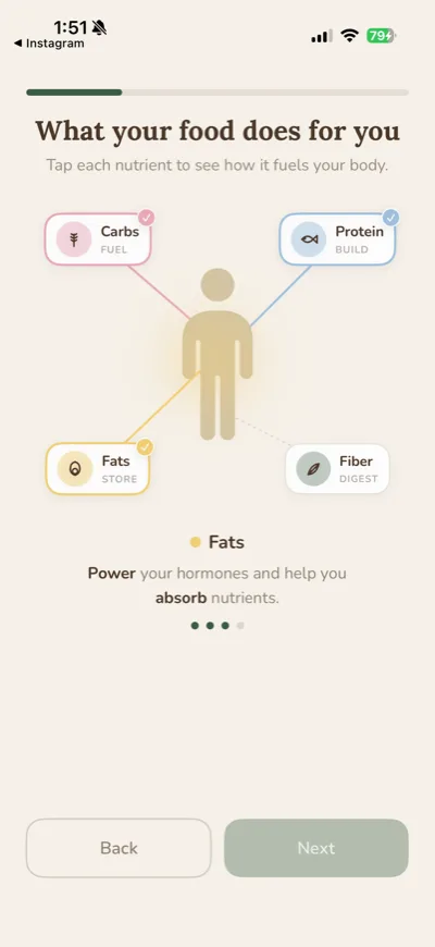
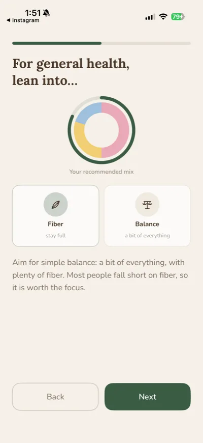
A warm onboarding that explains the app’s premise, and then goes into asking about cuisines you enjoy, your nutritional goals (very soft), kitchen tools you possess, what you can’t eat, and how long you typically spend cooking. It then writes a TasteProfile. Since the app is not a rigid health app but still has a health forward philosophy, it briefly explains the benefits of different types of macros on the body to subconsciously remind the user of that.
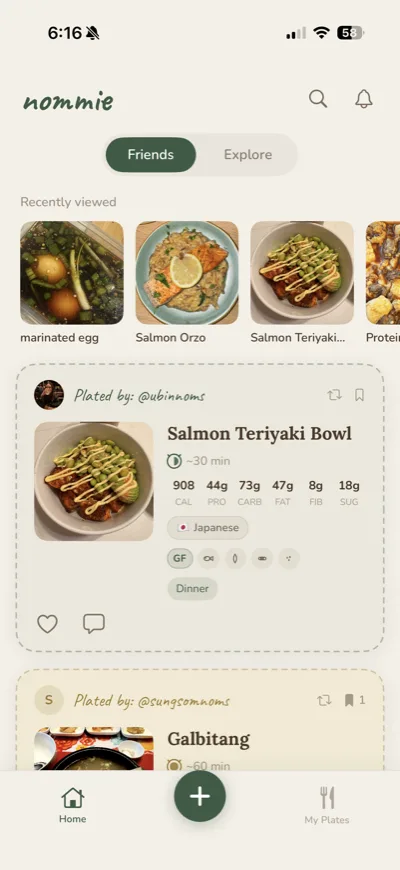
Home has a Friends / Explore toggle. Explore ranks every recipe with a content-based scorer (DiscoveryRanker): cuisine affinity, diet overlap, protein-fit weighted by how much you care, time budget, a goal nudge, log-capped popularity, and freshness decay. Allergens are a hard filter; missing tools soft-penalize in Explore and hard-filter in Home. Jitter and cuisine round-robin keep it fresh, and it falls back to popularity for brand-new cooks. Collaborative filtering slots into the same function later.
On your profile, there is a mini dashboard showing your goal’s recommended macro split against the average of what you actually cooked that week. It is meant to show a soft holistic overview of how you typically cook and what macros you could try to incorporate more of. Never any rigid language or diet culture present.
The nutrition layer is a balance mirror, never a calorie tracker or a diet-shaming tool. It reflects how you typically cook back to you, warmly, and stops there. Ethical wellness and a home cooking encouragement focus is the goal.
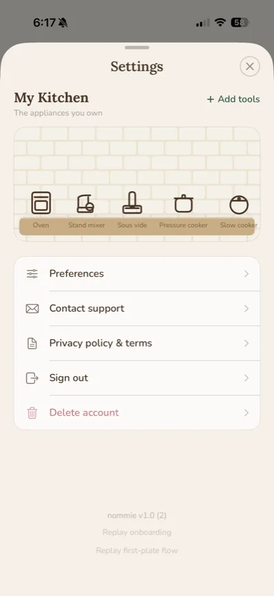
The kitchen tools section in settings I had a lot of fun making. Settings always feels so stale and I thought, if there is an option to select what tools you own, wouldn’t it be fun to display it in a way that has it sit on a kitchen counter? It still works properly as well and I hoped it would bring a bit of whimsical energy to this normally boring section.
My workflow
I wrote the product plan, the design language, and the specs. AI worked from them as my engineering team, which is what made a four month solo build possible.
A personal reflection
I designed and built Nommie end to end, and the process changed how I think about making a product. Testing taught me that a share should never be forced, and the biggest growth came from learning to think past the screen and design a reason to return.
I spent the first two months designing screens before anyone outside my own kitchen was using it. The retention problem was sitting in my flow map the whole time and I did not see it until testers showed me. Next time the smallest working version goes out first, and the visual system follows the behaviour instead of leading it.
I would also pick the persona earlier. Trying to be a recipe app for everyone cost me about a month of work that the narrowing then undid.
Nommie only just shipped, so these are targets rather than results.
The app is built end to end, and it is live on the App Store.
No, and I was careful about that. No daily target, and nothing turns red. The nutrition layer is a weekly mirror of how you have been cooking, and then it stops talking.
No. A weekly mirror, never a daily target.
No. Quantities are encouraged, never required. Precision is a choice you make per recipe, which is why a card still takes about a minute.
No. Quantities are encouraged, never required.
It never invents content. You write the process the way you would tell a friend, and one call reads it back as structured steps and does the macro math. Anything AI filled glows green until you touch it, so you always know what is yours.
No. It structures your own words, nothing more.
Then you will not be shown recipes that need one. You build your kitchen in settings, and that feeds the recommender. Missing tools soften a recipe in Explore and filter it out at home.
Then you will not be shown recipes that need one.
Because a card can leave. It carries a QR code back to your cookbook, so a recipe shared anywhere else still points home. The card is the product and the marketing at once.
A card can leave. Its QR code points back home.
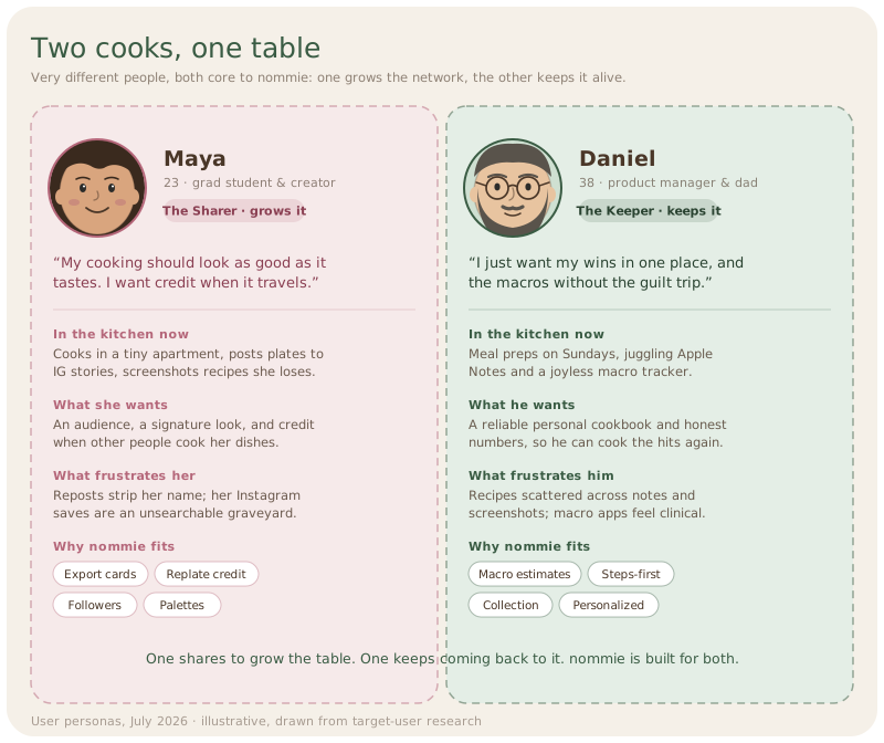
Supported, by design. Testing turned up two kinds of cook: one shares to be seen, one just wants their wins in one place. Sharing is offered, never forced.
Supported by design. Sharing is offered, never forced.
Yes. Research, brand, illustration, the SwiftUI app, and the Firebase backend, solo. AI was my engineering team, working from specs and a design system I wrote.
Yes. Research, brand, the SwiftUI app, the backend, solo.
Yes. Nommie is live on the App Store. It went through TestFlight with real cooks in their own kitchens first, and shipped as version 1.0.
Yes. It is live on the App Store.
From real kitchens
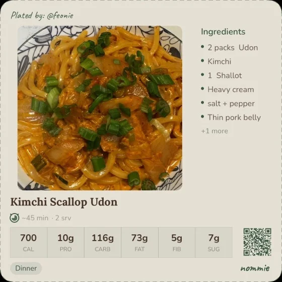
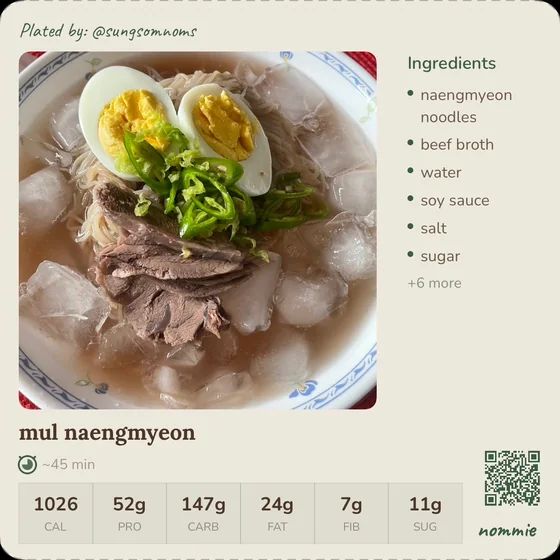
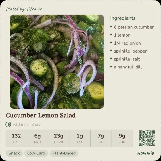
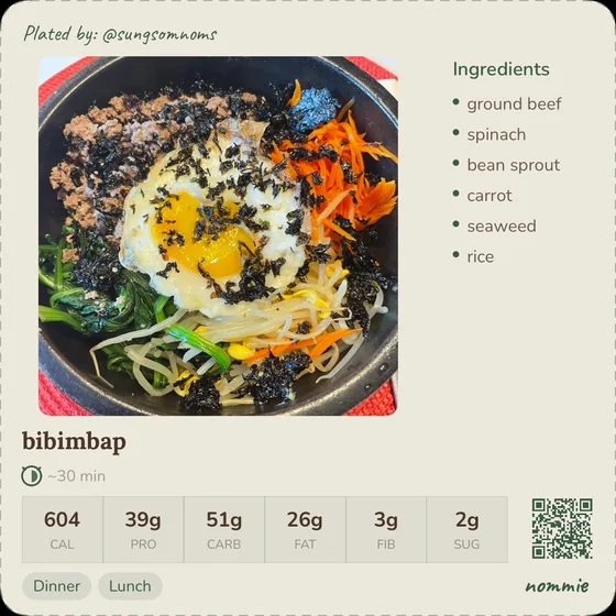
A closing slideshow of real recipe cards plated by Nommie users, back to the human feeling the whole thing started from.